The Unknown Pleasures of Paper and Colour: James Cropper x The Independent Paper Show Manchester 2026

Published:
11 Jun 2026
The yellow of the Metrolink tram. The glimmering grey of the canal, reflecting and contrasting against the vibrant rainbows of the Gay Village. Devil red and sky blue. The colour of Manchester defines the city, and yet that colour itself is almost impossible to define. Each one tells its own story, shaping our memories and emotions surrounding the place.

These colours aren’t just an incidental backdrop to daily life in the city. They are part of a living, breathing identity that moulds, and is moulded by, the people of the city. The cult status of the Hacienda nightclub is inseparable from the iconic yellow and black pillars that supported the building.

It makes an interesting metaphor for the importance of colour. Just as those pillars sat in the heart of the nightclub, an integral part of its structure, so too does the deep black and vibrant yellow hazard stripe design support the legacy of the place. People’s memories of their time there might be hazy for a variety of reasons, but that striped motif will never fade.

In places like Manchester, ‘local colour’ is something very literal. And, when the Independent Paper Show sets up in the city on 9-10 June, it will absorb that local colour like paper fibres soak up dyes.

World in emotion

Part of the beauty of local colour is that there is an element of subjectivity to it. That makes it personal and meaningful.

At James Cropper, that connection is something we thrive on. We believe strongly that colour can’t be invented, but instead it can be recovered. And, given the emotional power that colour can have, especially when tied to our memories of a place, we know it has to be respected.

As the first UK-based show to take place outside of London, a big topic of the show will be on this local colour. Not just what it is, but how best to translate that colour into physical form, plucking it out of the abstract and into forms that can be enjoyed by consumers, creatives, and businesses.

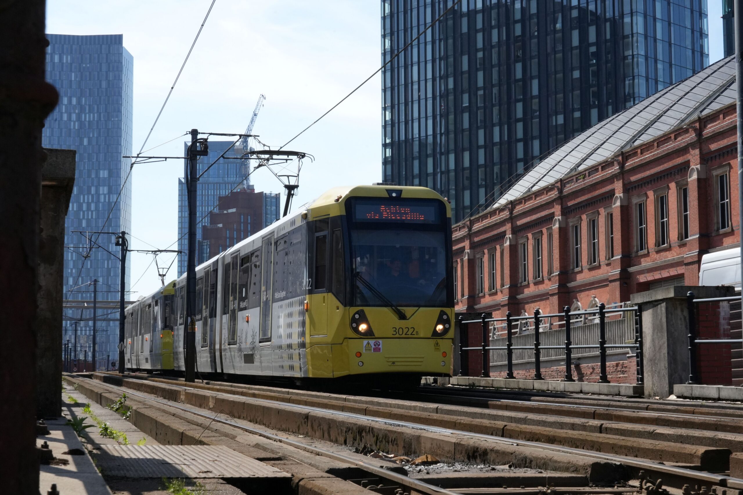
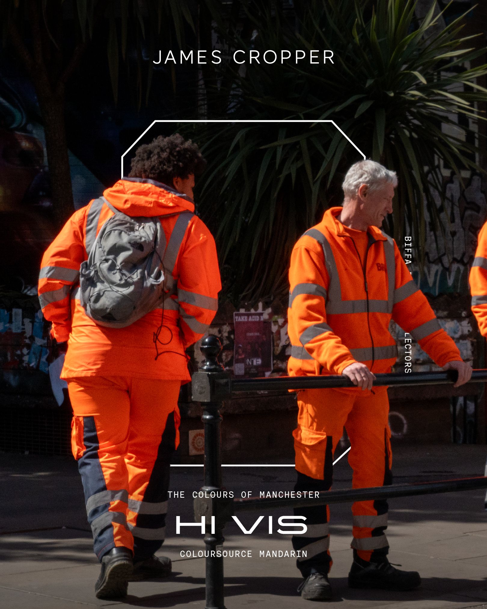
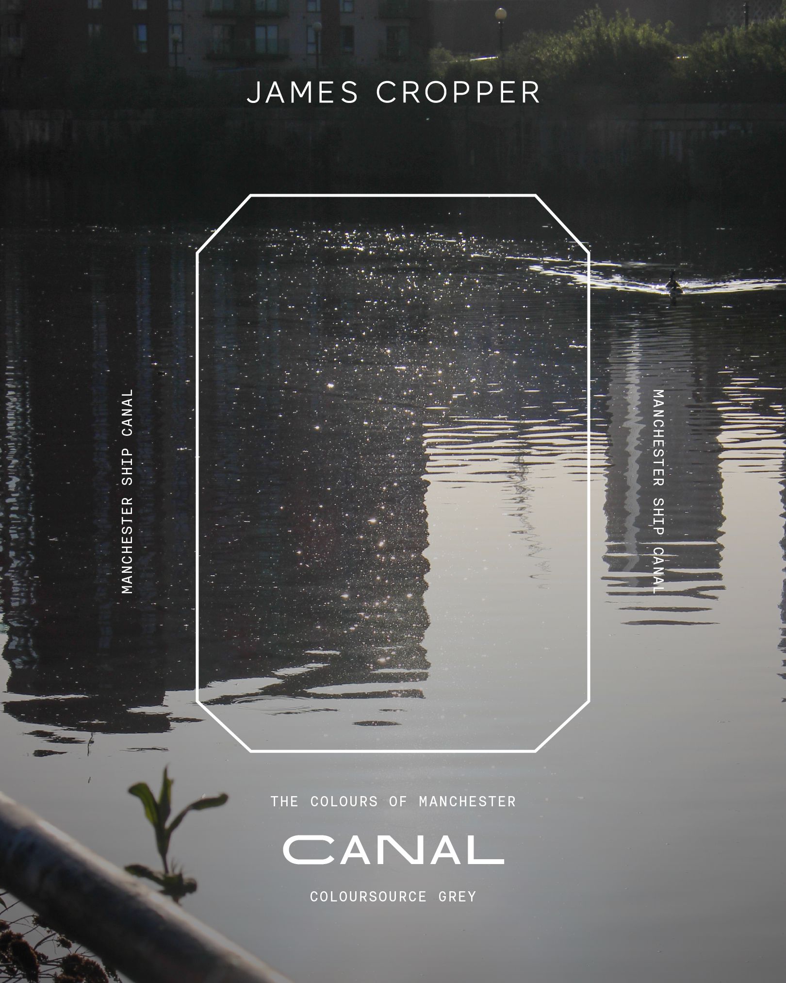
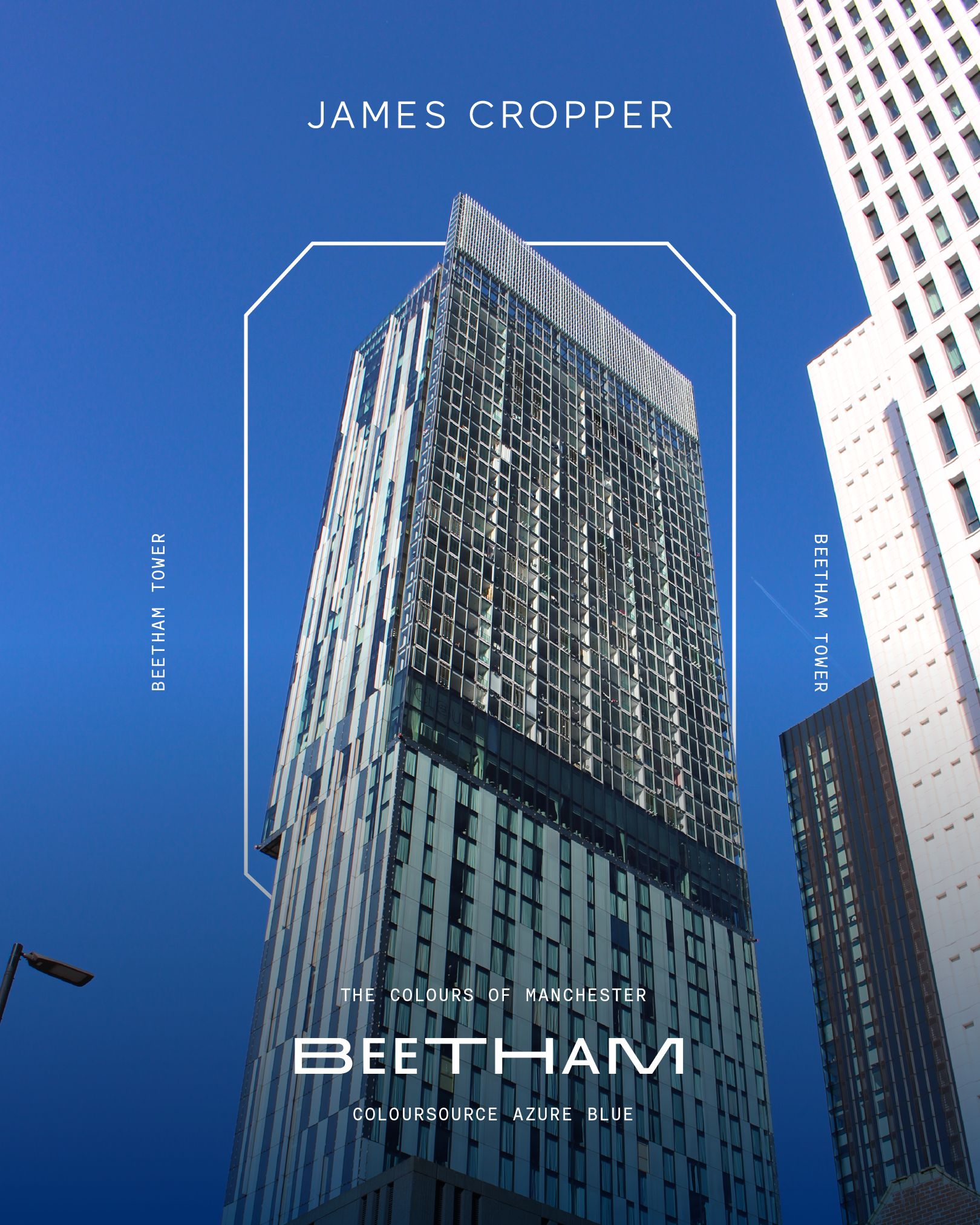
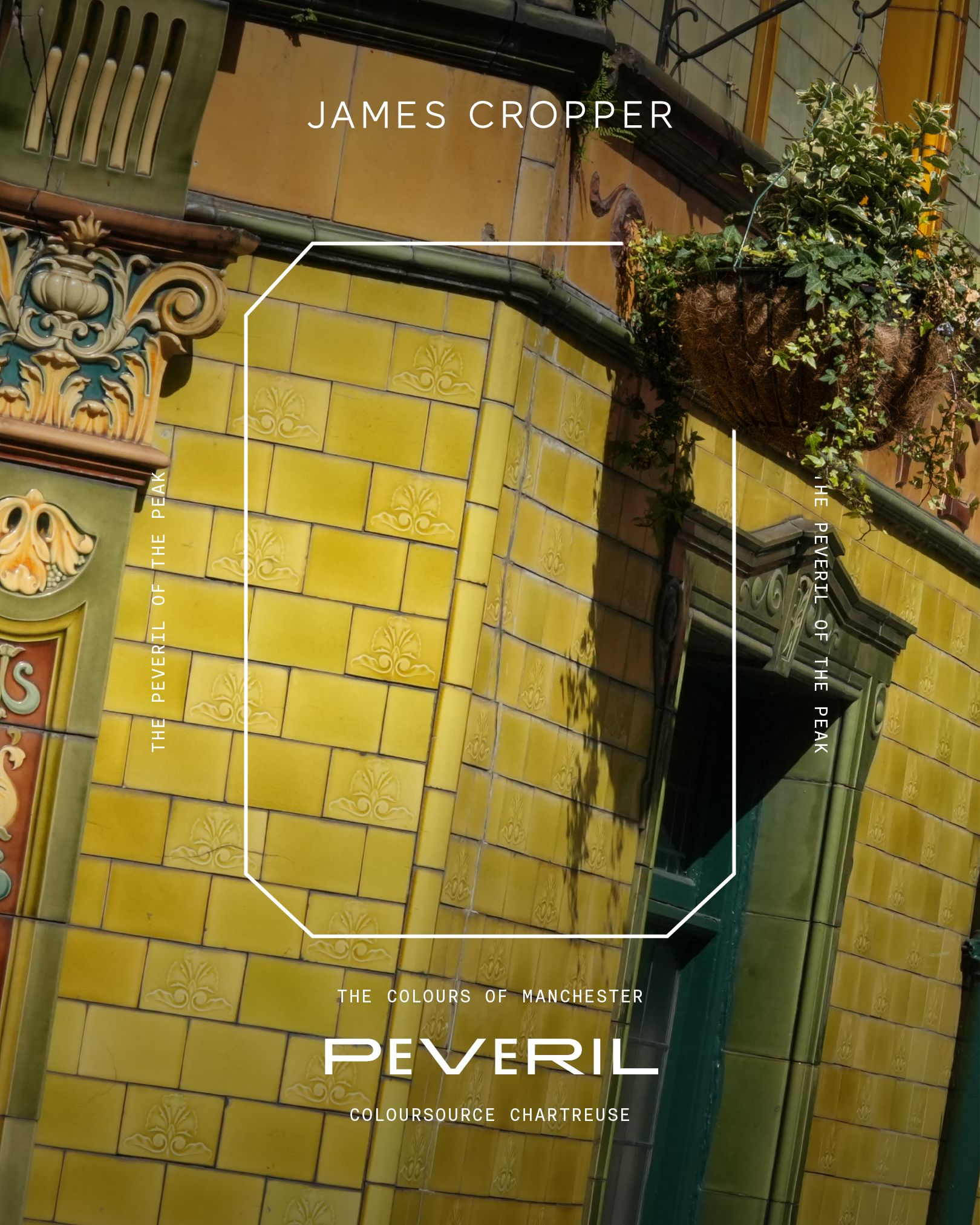
But what is the colour of Manchester? How can it be defined when it can be so subjective? Even if two people agree that the colour of Manchester is the grey of a rainy sky, for example, what specific grey do they have in mind?

And then there are the more abstract choices, inspired not by a physical location but by its culture and personality. The comforting, lived-in cream of Oasis’ Definitely Maybe. The provocative, acidic yellow and blue combination of The Buzzcocks’ Orgasm Addict. The faded, tobacco-stained beige of The Royle Family living room. Or, maybe, something utterly unique based on an individual’s experience – a favourite meal, a special item of clothing found in the Northern Quarter, or any one of an infinite number of possibilities.

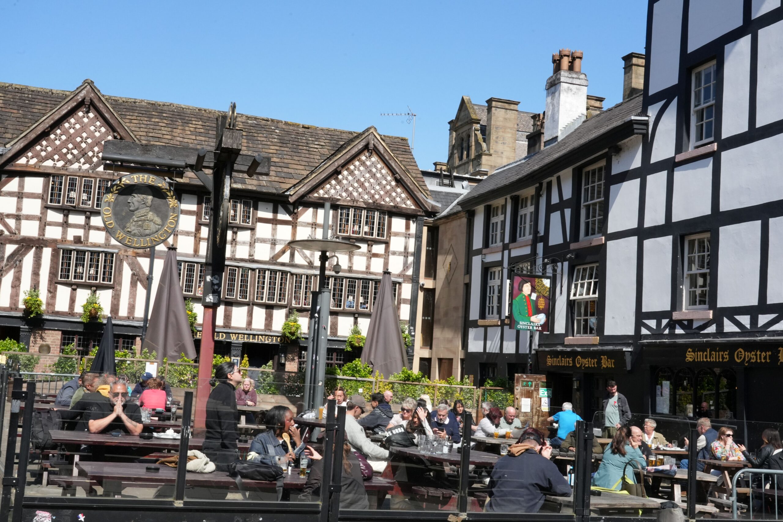
These colours are all small fragments that make up the fabric of the city and of our lives. IPS 2026 represents an opportunity to recognise and reflect on this shared cultural tapestry and the colour palette that makes it uniquely Mancunian. It’s less an exhibition and more a mapping exercise, providing an invaluable resource for creatives and professionals to tap into.

From street to sheet

Colour and paper are so critical to this because they enhance our cultural understanding of places like Manchester. Anyone can describe a place by listing facts and figures, but that can never do justice to what really makes it unique. Manchester is more than its canal, its Oyster Bar, and its gothic Town Hall, and navigating the full breadth of the MCR experience is impossible without tapping into its colour.

Colour is the difference between reading about the Oasis homecoming shows at Heaton Park last year on Wikipedia and experiencing it for yourself. It’s the difference between learning and understanding, and understanding is what resonates with people. That gives it immense value on both a commercial and an emotional level, if it’s treated with care.

Embedding colour into paper is easier said than done, and it requires a mix of technical skill and emotional expertise. Uncoated paper surfaces respond to light with the same level of variance seen in the streets of Manchester, and depending on the type of fibres pressed into the paper, two coloured sheets that look the same under lab lighting can look very different from one another under the light of a retail store.

That is why colour in papermaking has to be more than a visual match. It has to be a material interpretation. The right shade needs depth, consistency, tactility, and context. It has to carry the story without flattening it.

That is where the Independent Paper Show becomes so important. Bringing together makers, designers, specifiers, brands, and creative thinkers in Manchester gives the industry a chance to experience the living colour of Manchester as more than a finishing detail, and to use that experience as the foundation for better ideas. A colour can root a campaign in place, give packaging a stronger emotional pull, or help a brand express something that words alone cannot reach.

Get in Touch with James Cropper

Contact James Cropper to explore how colour, paper and place can be translated into bespoke material and creative solutions.