The definition of luxury.
A bottle of champagne, immersed in an ice bucket and wrapped in a white towel. Perhaps it’s next to a pool in the South of France. Maybe by a table in a New York restaurant.
A bottle of champagne, immersed in an ice bucket and wrapped in a white towel. Perhaps it’s next to a pool in the South of France. Maybe by a table in a New York restaurant.
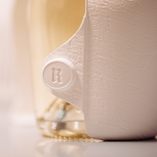
Made from recycled fibrous pulp, the papier-mâché-like white mould envelopes Ruinart’s iconic silhouette, protecting the contents from UV rays and providing an elegant solution to packaging. The design has won countless accolades, and picked up two Pencils at this year’s D&AD awards – including a Yellow in Luxury Packaging Design.
Much of the business’s success is down to the little quirks of production, such as champagne being stored in chalk cellars, or crayères. we were keen to reflect this production process in the final packaging. The Ruinart cellars keep the champagne at the perfect temperature – it’s a big part of how Ruinart stores its bottles. We tried to bring through that story in the look and feel of the packaging, and literally put that process into their customer’s hands.
The outer packaging is usually the first thing people see or touch, and in a saturated market it’s important that it instantly conveys a brand’s ethos, history, or spirit.
We spent a lot of time looking and collaborating on the clasp, this touch point. It might be someone’s first interaction with the Ruinart brand, so they wanted it to be really positive. The design had to get the branding on there, but not at the expense of its sleek function. The click was really important for them. It was really challenging for us, but we really like being challenged.


