The technical expertise behind beautiful paper products

Published:
27 Jul 2026
Beauty and technical quality are often discussed as competing concepts. Like art and science or oil and water, one ultimately has to dominate the other in a finished product. At James Cropper, the team holds a different view – that the two concepts complement one another, and that technical expertise is essential for achieving beautiful results.

Beauty doesn’t just happen. Behind every beautiful thing mankind has ever made lie dozens of intricate, delicate processes and materials that all work together to deliver one beautiful end product.

Paintings need an artist with talent and vision, yes – but they also need the paint. That paint needs to be made and mixed to be colour-accurate, lightfast, and to offer the right finish. It needs to be applied using a brush, precisely assembled using the right bristles in the right shape. And it needs to be applied to a canvas that itself is carefully colour-managed, produced with a smoothness that gives the end result the desired texture.

These aren’t incidental technical details, they are the building blocks of beauty, and the things that enable creative teams to turn abstract ideas into tangible reality. This ethos is one shared by our team at the James Cropper mill because, ultimately, printed paper products can only ever be as beautiful as the material allows them to be.

Making ideas work on paper

Paper development is a creative process, and like any creative process, it begins with an ambition. A designer or customer may want to replicate a colour they’ve seen in the brand world, or they may want to use a specific shade taken from nature. They may not have anything specific in mind at all and simply want to capture a general palette, or even just communicate an emotion.

Other ambitions are more practical and process-driven. Uncoated and darker coloured materials are more difficult to print on using traditional offset processes, often requiring additional steps like printed white base layers to accurately capture CMYK designs. This also applies when trying to achieve a particular tactile effect, especially for premium and luxury applications.

Of course, realising this ambition in a single sheet of paper isn’t enough. It has to be executed consistently and at scale, delivering at every step of the value chain from production to finishing, packing, and retail. Achieving a beautiful end result is one thing, but technical and quality control are the things that make those results achievable and repeatable.

It requires a deep understanding of fibre, colour chemistry, dye and pigment formation, surface behaviour, strength, texture, and process conditions. And it means knowing how a material will behave in production, but also how it will be perceived in the hand, on shelf, under various lighting conditions, and through the converting process.

True colours

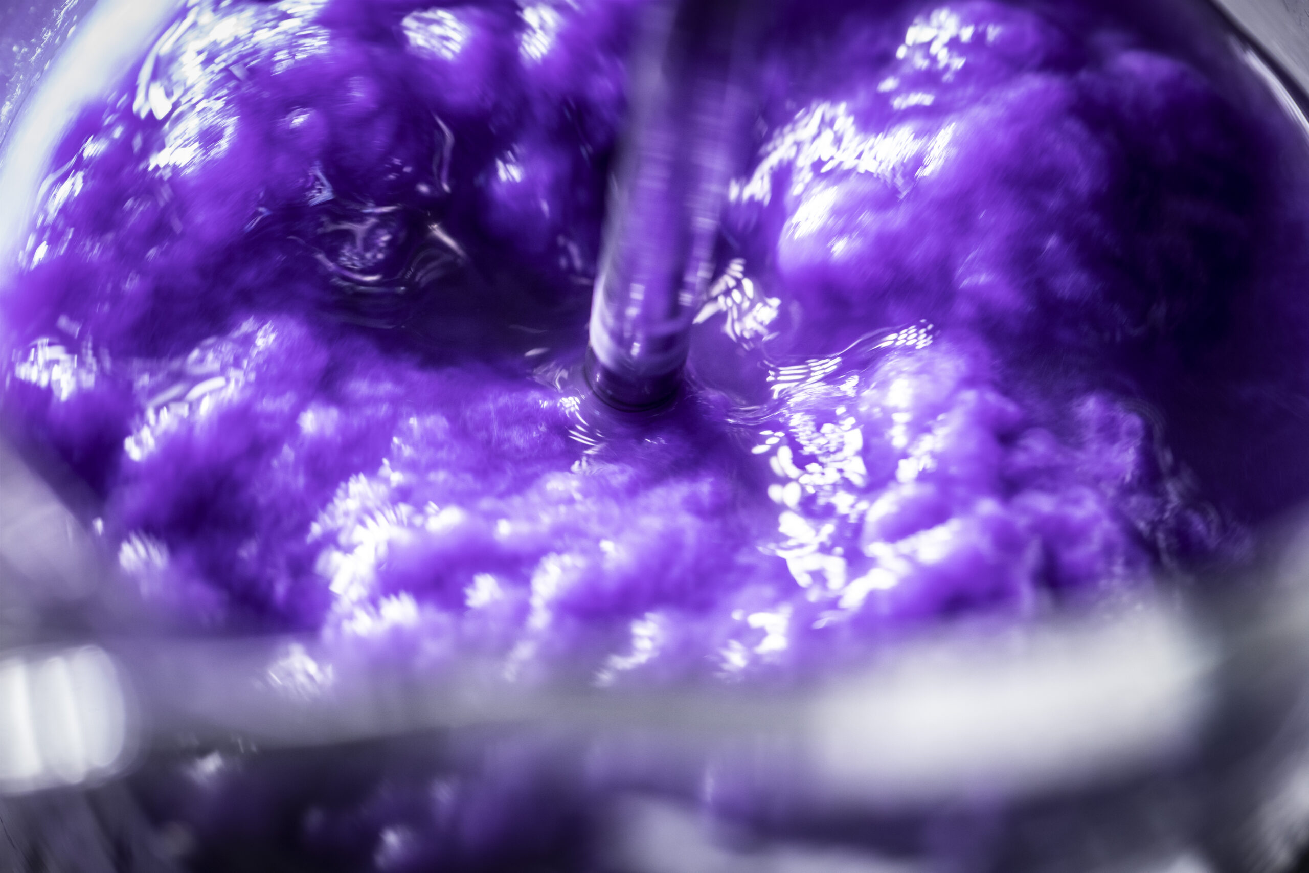
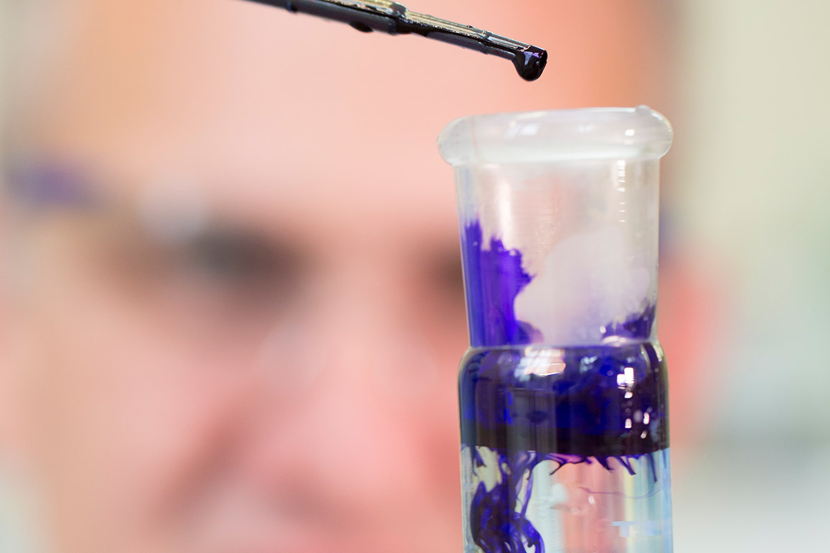
Colour makes for an interesting case study of this. A shade is never just a single static thing. Its appearance can be influenced by fibre type, dye and pigment behaviour, sheet formation, surface finish, light source, and end-use application. A colour that appears correct in one condition may shift subtly in another.

And even if all of the above is absolutely identical, there is a level of subjectivity to colour that means two people can be looking at the same colour in the same room, yet perceive it completely differently. Colour is very much in the eye of the beholder. For premium brands, those subtleties matter, as they can be the difference between close and correct.

The same is true of texture and finish. A tactile surface must deliver the desired sensory effect, but it also has to support printability, folding, durability, and consistency. Weight and thickness must feel right but also perform through the realities of production and use. Every characteristic is connected and changing one can affect the other. For example, applying a tactile varnish to a paper material can affect its colour and the colours that are printed on it.

This is where technical expertise becomes a creative safeguard, enabling creative teams to anticipate and mitigate risk long before they are forced to compromise.

The effort behind consistency

Consistency often looks effortless and automatic when presses and folder-gluers start running. Those working in print and packaging know that it is anything but.

The sheets that run through production lines look uniform, but this doesn’t happen by chance. Behind that apparent simplicity is a living material made from natural fibres, each with its own behaviour, structure and response to process conditions.

Taming those variables requires a mix of scientific rigour and personal experience working in tandem. Testing and measurement play a role, but what matters about colour can only truly be judged by people rather than machines, so observation by experienced professionals is also key.

This isn’t about removing the character of paper – quite the opposite. It is about understanding the character of the material and using it in service of the final design.

For designers and brands, this expertise creates confidence. It means the material chosen at the development stage can be carried through into production with integrity, and the emotional quality of the original idea will not be diluted by avoidable technical issues. It means a finished sheet can feel as intended and function as required.

Changing the perception of paper

At the James Cropper mill, we regularly hold tours for customers, colleagues, and other parties looking for insight into papercraft. For many, the most powerful realisation is how much knowledge sits behind a material they thought they understood.

Paper is familiar, after all. It is part of everyday life. It’s been produced at the James Cropper mill for over 180 years, and people have been making it in one way or another for thousands of years before that. This kind of familiarity can make it easy to underestimate. Yet once people see the laboratories, the testing, the colour development, the specialist decision-making, and the precision required in specialty papermaking, their perception changes.

They begin to see paper as an engineered, creatively inspiring material that adds a value all of its own. One capable of carrying colour, texture, performance, sustainability, and story in a single sheet.

As brands ask more from packaging and materials, this kind of mindset shift is increasingly relevant as paper is expected to deliver on multiple fronts at once. It must be beautiful, responsible, practical, distinctive, and commercially viable. Achieving that balance requires collaboration between creative, technical, and production teams from the earliest stages of development.

When that collaboration works, technical knowledge acts as fuel for creativity.

Often, the detailed technical work and expertise that went into the final product is masked by its beauty. The Mona Lisa was created by Leonardo Da Vinci, but it was also created by oxides of manganese, lead, and other pigments, applied using brushes made of silk onto a white poplar wood panel. Without each of those elements and their own unique characteristics, the final vision could never have been realised.

In this sense, technical excellence can never be separated from creativity. It is what enables creativity to survive the journey from concept to reality. Part of the James Cropper way is to ensure every beautiful piece of paper is more than a material. It is a carefully protected idea, made tangible through science, craftsmanship, and care.

And when that work is done well, the science disappears, leaving only the experience you remember.
Bring your vision to life

Whether you're developing luxury packaging, exploring bespoke paper solutions or solving a complex technical challenge, our specialists are ready to help. Get in touch with the James Cropper team to start the conversation.