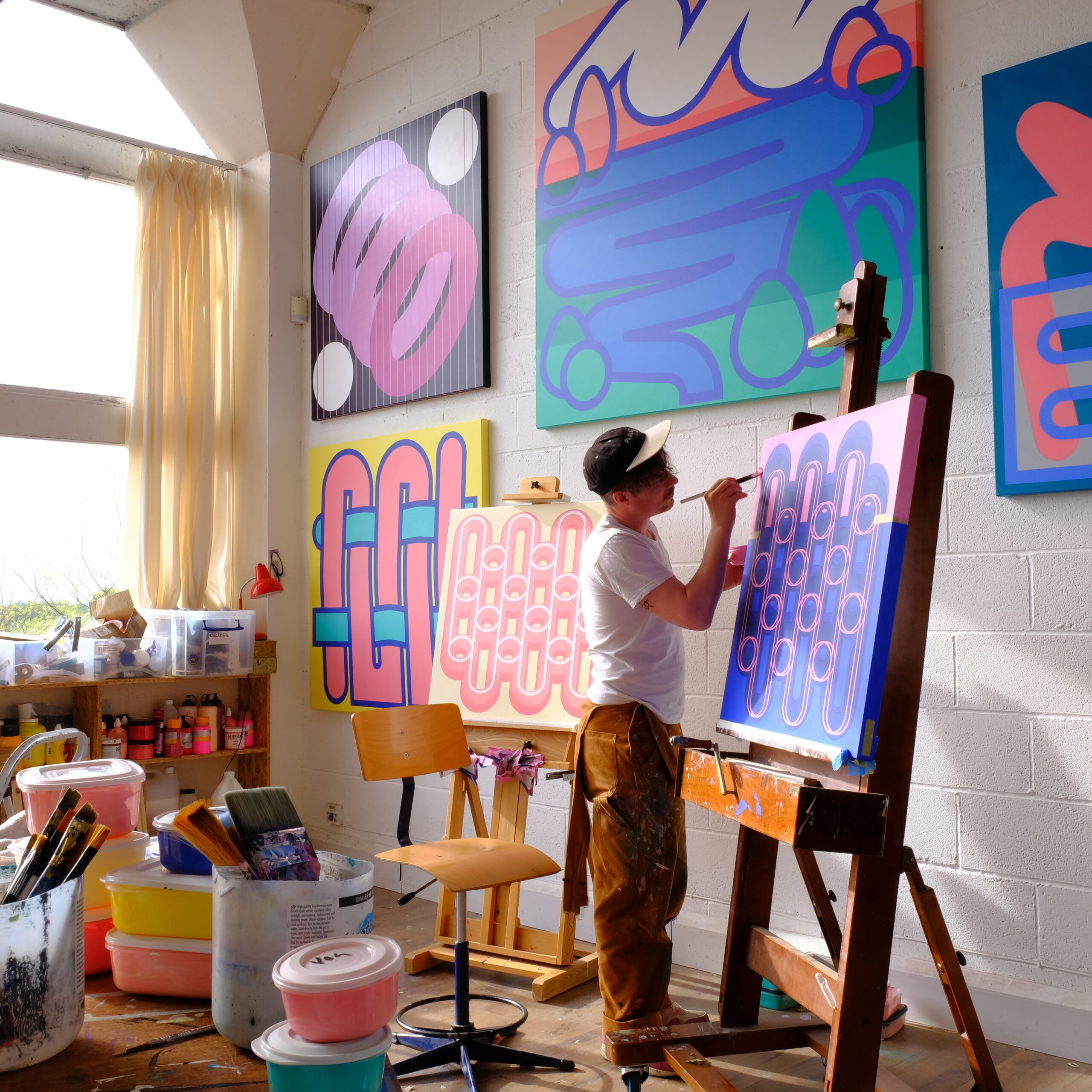
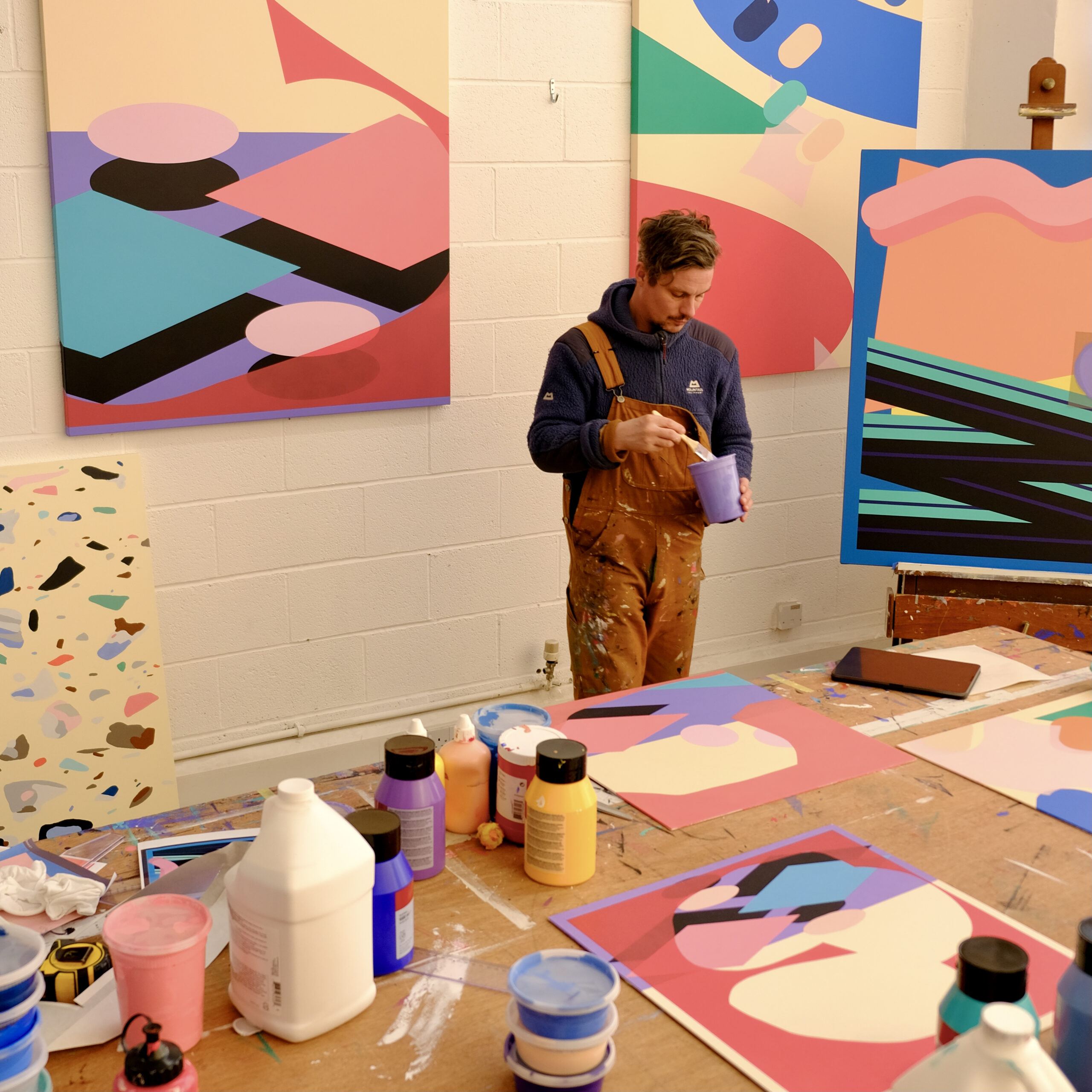
The material didn’t just shape how the works were made.
It began to influence how they looked.
For one piece, Giles had already designed a colour palette. But when he began laying James Cropper swatches against the artwork, some of his original combinations no longer felt right.
“At first, I felt like I was making compromises when I changed one colour,” he says.
Then something unexpected happened.
“I started to notice that if I took a completely different colour from the palette that I was provided with, then all of a sudden it created something new. A new palette, but one that was actually better than the one I designed.”
Giles describes the experience as an “unintended collaboration”.
At that point, he had never spoken to James Cropper. Yet the Coloursource™ palette had already become part of his creative process.
“I found myself sort of collaborating with what I had on offer,” he says. “I came up with something better than my original idea by following the palette that I had at my disposal.”
Later, when Giles visited James Cropper’s mill, one area immediately resonated.
“Going into the colour lab and seeing how they create bespoke colours for clients with incredibly discerning demands, the accuracy of the reproduction that they can create is amazing,” he says.
“It’s after my own heart.”
As a painter who takes enormous satisfaction from mixing exactly the right colour, Giles recognised the same pursuit of precision in papermaking that he had long pursued in his own studio.
Getting closer
When the finished works went on display, Giles noticed something.
People walked towards them.
From a distance, the pieces appeared almost impossibly flat. Many assumed they were printed.
Then they moved closer.
“People liked getting really close to the work and seeing the layers and seeing that it was paper,” he says. “It was so flat and so precise.”
Only at close range did the engineering reveal itself.
The cut edges became visible. The layers emerged. What looked like a perfectly flat graphic image became a carefully constructed object.
“People like being able to see how something is engineered,” says Giles.
For him, that response was deeply satisfying.
But the biggest surprise belonged to the artist himself.
For years, he had been trying to achieve something in paint that paint simply could not deliver.
Paper could.
“It gives a perfect flat finish, which is almost completely unachievable in paint,” he says.
“After I’d abandoned the idea of ever being able to do that with paint, I was able to achieve it with paper.”
Giles describes the experience as being “reintroduced to paper”.
It is a fitting phrase.
A material he thought he knew had become something entirely different, not simply a replacement for paint but a creative medium capable of changing both his process and his thinking.
Already, he is considering thicker layers, combining paper with paint and exploring new forms of construction.
“The possibilities become kind of endless once you add in lots of different multipliers.”
A brief that began with a restriction led him somewhere entirely unexpected.
Working with Coloursource™, Giles had discovered that paper could offer something paint never could.